Attribute charts are a kind of control chart to display information about defects and defectives. They help you visualize the enemy–variation!
Just like the name would indicate, Attribution Charts are for attribute data–data that can be counted. In other words, the data that counts the number of defective items or the number of defects per unit. At the same time, variable charts like X̅ and R charts are used for measurable quantities such as length, weight, and height.
If your process can be measured in attribute data, then attribute charts can show you exactly where in the process you’re having problems, if any.
Defect vs. Defective
A defect is a non-conformity that does not meet the customer’s requirements. A product or service may have one or more defects but is defective only if defects prevent the product from functioning.
Defects are the subsets of defective and can be categorized as minor, medium, and major based on criticality. Often non-conformity is used to signify the defects. For example, dimension differences or the failure of visual, safety, and functional requirements, etc.
Defect analysis is carried out based on the Poisson distribution (evaluates the rate of defects in the process) using the following methods.
- 1 sample Poisson rate test
- 2 sample Poisson rate test
- c chart ( for constant sample size)
- u chart (for variable sample size)
- Poisson capability analysis
A product or service that has one or more defects and it is not suitable for use. In other words, a product or service is defective if the defect(s) existing in it affects its functionality.
Often non-conforming is used to signify the defectives—each product or service experiences only two choices, i.e., defective or not.
Using the following methods, a defective analysis is carried out based on Binomial distribution (evaluates the proportion of defectives in the process).
- 1 proportion test
- 2 proportion test
- p chart ( for variable sample size)
- np chart (for constant sample size)
- Binomial capability analysis

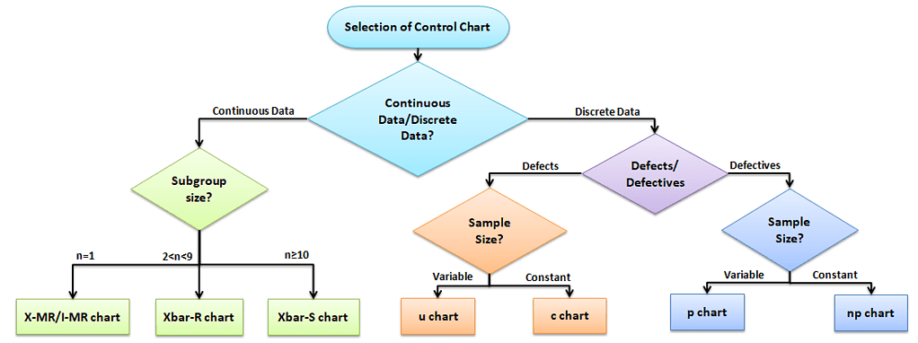
Selection of control chart
The control chart is a graph used to study how a process changes over time. A control chart always has a central line for the average, an upper line for the upper control limit, and the lower line for the lower control limit. The control limits are ±3σ from the centerline.
Selection of the appropriate control chart is very important in control charts mapping, otherwise ended up with inaccurate control limits for the data.
Using Attribute Charts
Attribute charts are used for charting either-or conditions over time for either static sample sizes (ex 10 samples every week) or varying sample sizes.
Six Sigma certification exams like to throw curveballs about how and when to apply certain attribute charts to different situations. Here’s a quick way for you to determine which chart to use in which situation.
Types of Attribute Charts
There are four types of Attribute Charts:
How to Pick Which Attribute Chart to Use for Defects or Defectives
Assuming that one or more defects in a product make the product entirely defective, you can use the following guide to pick which one to use. For example, If the Quality inspector monitors 100 bottles of information every shift, then it is a constant lot size. Similarly, if the quality inspection monitors 10% of bottle information from the production, the lot size varies based on the number of bottles produced on that particular shift.

Different Attribute Charts
There are four main attribute charts. Let’s take a close look at each.
| Type of Attribute Chart | What Gets Displayed? | What Kind of Sample Size? | Type of Data Used | Example |
| np | # times something happens | Constant size | happens/ does not happen | # transactions in a static sample set with one or more errors. |
| p | % of Samples in which something happens | Constant or Varying size | happens/ does not happen | Sum of all transactions with an error per month charted month-over-month. |
| c | # times total something happens | Constant size | has a condition OR has more than one condition | # errors in all transactions in a static sample set. (transactions can have more than one kind of error.) |
| u | % of total in which something happens | Constant or Varying size | has a condition OR has more than one condition | Sum of all errors across all transactions per month charted month-over-month. |
Attribute Charts: p Chart (proportion chart)
What is a p Chart:
p chart is also known as the control chart for proportions. It is generally used to analyze the ratios of non-conforming or defective items in a process. It uses a binomial distribution to measure the proportion of defective or non-conforming units in a sample.
- Evaluate the stability of a process when we evaluate the proportion of defects vs. in good order as a percentage.
- The plot shows the percentage of defectives.
When to Use a p Chart:
p chart is one of the quality control charts used to assess trends and patterns in counts of binary events (e.g., pass, fail) over time. p charts are used when the subgroups are not equal in size and compute control limits based on the binomial distribution.
- Sample sizes are NOT equal.
- Have discrete data.
How to Use a p Chart:
Step 1) Calculate each subgroup’s non-conformities rate= np/n
- Where np = number of defectives in the sample
- n= sample size
Step 2) Compute centerline p̅ = total number of defectives / total number of samples =Σnp/Σn
Step 3) Find Control Limits: Calculate the upper control limit (UCL) and lower control limit (LCL). If LCL is negative, then consider it as 0. Since the sample sizes are unequal, the control limits vary from sample interval to sample interval.

Step 4) Plot the graph with the proportions on the y-axis, Lots on the x-axis: Draw the centreline (p̅) and control limits (UCL and LCL). Interpret the data to determine whether the process is in control.

Attribute Charts: np Chart
What are np Charts:
np chart is also known as the control chart for defectives (d-chart). It generally monitors the number of non-conforming or defective items in the measurement process. It uses binomial distribution to measure the number of defectives or non-conforming units in a sample.
- Evaluates the stability of a process when we are evaluating the proportion of defects as a raw number.
- The plot shows the # of defectives.
When to Use np Charts:
np chart is one of the quality control charts used to assess trends and patterns in counts of binary events (e.g., pass, fail) over time. np chart requires that the sample size of each subgroup be the same and compute control limits based on the binomial distribution.
- Sample sizes are equal or constant.
- Subgroups are the same size.
- Attributes are discrete and binary (ex. yes vs. no; up vs. down)
How to Use np Charts:
Step 1) Count the number of defectives in each sample
Step 2) Compute p̅ = total number of defectives / total number of samples =Σnp/Σn
- Where np = total number of defectives in the samples
- n= sample size
Step 3) Calculate centreline np̅ = total number of defectives/no of lots = Σnp/k
- Where k = number of lots
Step 4) Calculate the control limits

Step 5) Plot the graph with proportion on the y-axis and the number of samples on the x-axis: Draw the centreline (np̅) and control limits (UCL and LCL). Interpret the data to determine whether the process is in control.

Attribute Charts: C Charts
What are c charts
c chart is also known as the control chart for defects (i.e., counting the number of defects). It generally monitors the number of defects in consistently sized units.
- Evaluates the stability of counted data
- The plot shows the # of defects.
When to Use c Chart:
c chart is one of the quality control charts used to track the number of defects in a product of a constant size
- Total opportunity population is large compared to # defects.
- When you cannot count “not a defect.”
- Data type is discrete, but each count has an equal opportunity of coming up.
How to Use c Charts:
Step 1) Count the number of defects in each sample
Step 2) Compute centreline c̅ = total number of defects / number of samples =Σc/k
- Where c = number of defects
- k= number of samples
Step 3) Calculate the control limits

Step 4) Plot the graph with the number of defects on the y-axis and lots on the x-axis: Draw the centreline (c̅) and control limits (UCL and LCL). Interpret the data to determine whether the process is in control.

Attribute Charts: u Chart
What are u Charts:
u chart is also known as the control chart for defects per unit chart. It is generally used to monitor the count type of data where the sample size is greater than one.
- Evaluates the stability of counted data
- Measuring variable defects per unit. Helpful when you have lots of varying sample sizes.
- The plot shows defects per unit.
When to Use u Charts:
u chart is one of the quality control charts used to monitor the number of defects per unit of variable sample size.
- Sample size varies–ex. Multiple types of a defect.
How to use u Charts
Step 1) Calculate the number of defects per unit in each lot.
- u= number of defects in each lot/ lot size
Step 2) Compute centreline u̅= total number of defects / number of samples =Σc/Σn
- Where c = number of defects
- n= sample size
Step 3) Calculate Control limits: Since the sample sizes are unequal, the control limits vary from sample interval to sample interval.

Step 4) Plot the graph with the number of defects per unit on the y-axis and lots on the x-axis: Draw the centreline (u̅) and control limits (UCL and LCL). Interpret the data to determine whether the process is in control.

Example to select an appropriate attribute chart

Videos about Attribute Charts
ASQ Six Sigma Black Belt Attribute Charts Questions
Question: Which of the following control charts is most appropriate for monitoring the number of defects on different sample sizes?
(A) u
(B) np
(C) c
(D) p
Answer:
A: p charts are used to monitor discrete data. See the control chart matrix in downloads. Also, review attribute charts.
I & MR charts and X Bar charts are for continuous data, and When you have subgroups of size = 1. You use the ImR (XmR) chart only when logistical reasons prevent you from having larger subgroups or when there is no reasonable basis for rational subgroups.
Use X Bar R Control Charts when you have small amounts of constant, continuous data and when you can rationally collect measurements in subgroups of generally between two and 10 observations.