What is a p Chart?
Attribute charts: p chart is also known as the control chart for proportions. It is used to analyze the proportions of non-conforming or defective items in a process. It uses a Binomial Distribution to measure the proportion of defective or non-conforming units in a sample.
In the p-chart, proportions are plotted on the y-axis, and the number of samples is on the x-axis. The centerline of the p chart (p̅) is the total number of Defectives or non-conforming units divided by the total number of items sampled.

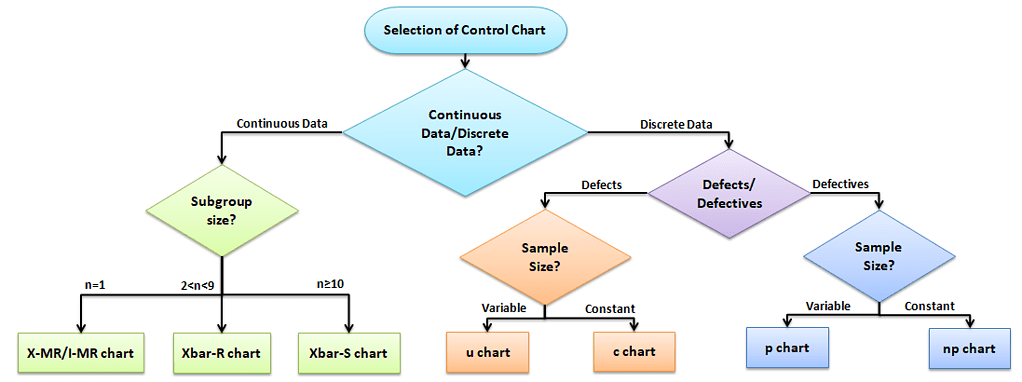
Selection of Control chart
The control chart is a graph used to study how a process changes over time. A control chart always has a central line for the average, an upper line for the upper control limit, and a lower line for the lower control limit. The control limits are ±3σ from the centerline.
Selection of an appropriate control chart is very important in control charts mapping, otherwise ended up with inaccurate control limits for the data.
X̅ and R charts are used for measurable quantities such as length, weight, and height. Attribute control charts are used for attribute data. In other words, the data that counts the number of defective items or the number of defects per unit. For example, the number of tubes failed on a shop floor. Unlike variable charts, only one chart is plotted for attributes.
Why and When do you use a p Chart?
p chart is one of the quality control charts used to assess trends and patterns in counts of binary events (e.g., pass, fail) over time. p charts are used when the subgroups are not equal in size and compute control limits based on the binomial distribution.
There are basically four types of control charts that exist for attribute data. np chart is for the number of defectives, and u chart is for the number of defects per unit, c chart is for the number of defects. Similarly, the p chart plots the proportion of defective items.

Assumptions of Attribute charts: p chart
- The probability of non-conformance is the same for each item
- There should be two events (pass or fail), and they are mutually exclusive
- Each unit is independent of the other
- The testing procedure should be the same for each lot
p Chart Formulas

- Where np = number of defectives in the sample
- k= number of lots
- n= sample size
How do you Create a p Chart
- Determine the subgroup size. The subgroup size must be large enough for the p chart; otherwise, control limits may not be accurate when estimated from the data.
- Calculate each subgroup non-conformities rate= np/n.
- Compute p̅ = total number of defectives / total number of samples =Σnp/Σn.
- Calculate the upper control limit (UCL) and low control limit (LCL). If LCL is negative, then consider it as 0. Since the sample sizes are unequal, the control limits vary from sample interval to sample interval.
- Plot the graph with proportion on the y-axis, and lots on the x-axis: Draw the centerline, UCL, and LCL.
- Finally, interpret the data to determine whether the process is in control.
Example of using a p Chart in a Six Sigma project
Example: ABC Manufacturing produces thousands of tubes every day. A Quality inspector randomly draws samples for 20 days and reports the defective tubes for each sample size. Based on the given data, prepare the control chart for the fraction defective and determine the process in statistical control.

Calculate each subgroup’s non-conformities rate= np/n

- no of lots k = 20
- n̅=Σn/k = 23040 / 20 =1152
Compute p̅ = total number of defectives / total number of samples =Σnp/Σn = 346 / 23040 = 0.01502
- 1- p̅ = 0.98498
Calculate the upper control limit (UCL) and low control limit (LCL). Since the sample sizes are unequal, the control limits vary from sample interval to sample interval.


Plot the graph with the proportion on the y-axis and the number of samples on the x-axis. Draw a center line (p̅), UCL, and LCL.

Interpret the chart: The proportion of defectives on day 13 is higher than the upper control limit (UCL). Therefore the process is out of control. Black belts or statisticians to identify the root cause for the cause and take appropriate corrective action to bring the process under control.
P Chart Excel Template
Uses of p chart
- To detect unexpected changes in the process, maybe a special cause in the process
- Monitor the process stability over time.
- Compare process performance before and after significant process improvements.
Videos of Attribute Charts: p Charts
Additional Helpful Links Attribute Charts: p Charts
Attribute Chart: P chart